Monday 17 November 2014

Studio work

Began late in the day so felt pressurised to produce something in a short space of time - culmination was I rushed into work, not giving myself adequate time to plan and think through what media and support I was going to use.  The Fabriano paper I have is only 120gsm and therefore ripples and distorts when lots of water applied and I would really like to indulge myself and experiment on much heavier watercolour paper.  At this early stage in developing ideas it is not really necessary and would be rather costly.
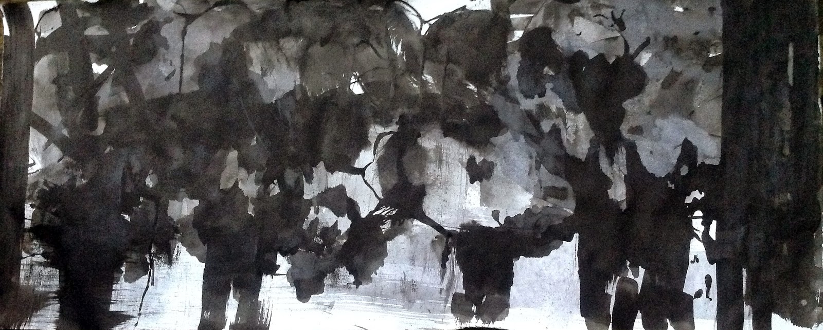
Although conscious of the limited time I had decided on the format of the support and prepared a long horizontal strip of paper.  Applied washes and took blind mono prints along the length and then worked further ink into the designs. Again, this produced a good range of tones and shapes, not a lot of texture, but overall it worked well as a horizontal composition but had lack of space.  I felt the image was successful in portraying size and irregular shape of oak trees but felt the light was in the wrong place and overall there was very little depth to the work.  I also cropped the image by 25% on the left hand side.


Below are two cropped sections from the original work


This image below is the result of drawing different size oak leaves using a cedar bark brush dipped ink.  They were small images which were then cut up into various geometric shapes and collage together on one A4 paper. The paper was then cut in half and joined to present as a long horizontal piece.  My initial response was that it was rather decorative but upon review I found some interesting qualities, It presents a kind of  calligraphic 'tree writing',suggesting its own narrative in relation to leaves and branches of the tree.  This could be developed as a long scroll with other elements of the oak tree included - acorns, flowers. The collage itself has too many dividing lines where the paper was cut and  I may try to reproduce the image on one long sheet of paper


Finally, a photograph of a favourite item which I have used often to apply both oil and ink to work.This variegated wooden comb creates some wonderful marks and has now become a work of art in itself.


Thursday 13 November 2014

Experimenting with brush and ink


Following on from working through my ideas generated by Colin Crumplin's diptych paintings I experimented with oil and ink on Fabriano using various techniques.  I regretted using the oil paint and found that some of the imagery became very muddy as I applied different layers. It became difficult to remove colour even when applying turps as the paint had become too embedded in the surface of the paper. However, there were some more unexpected happy accidents and a technique of building up an image evolved.  As is my habit I sought to find some redeeming element in the sketches.  The paintings reflected an oriental aesthetic and I found the 'failed' worked presented better when placed in a cylindrical form, taking the form of oriental tall vases with the oak tree design being glimpsed in a very subtle way.  A more comprehensive journal entry can be found on file in regard to these exercises with some 'happy accidents' which developed from using sugar paper to remove excess ink and paint from brushes before making work.


The following day managed to have an hour or so in the studio experimenting with brush and ink. Using various tones of diluted ink to make a variety of images based on oaks in the landscape. Using watercolour paper of a good weight I used wet into wet, wet on dry, transfer and line.  It can be a difficult medium to control, but this is part of its appeal - the unexpected. I used the reverse of the textured paper which was smoother as I did not like the weave type texture. Working on A4 was
restrictive and movement were inevitable tighter - need to work larger. Some good tonal values were achieved in the first landscape image and I felt overall I responded more to shape and space - lots more practice required.

 
Small A5 sketches with texture created by blind monoprint and then worked over with various washes and marks. The right hand image atttempted to represent depth of landscape with oak trees which are often found growing on boundaries of fields dictating the dimensions of agricultural fields.  I have also noticed that there is often a solitary oak tree left, almost like a sentinel looking out and keeping watch.  
Rather too realistic and very little variation in tone.  The line work placed on top made the image a little more interesting!


The images below provide a good contrast into design elements and composition in regard to oak trees in the landscape.  I aim to experiment further using shapes and blocks of varying tones and not include too much detail - keep it simple.


Are these recognizable as oak trees?  I am not sure and feel there are elements of trees growing by water when in fact my intention was to indicate a field in the foreground.


Saturday 8 November 2014

Getting to know my object continued

Eventually found time to continue 'getting to know my object'.  Having been disappointed with how I had presented the first sketches in my sketch book decided to work on good quality watercolour paper for the second 'batch'.  These could then be mounted in the sketch book and be removed easily in order to extend and develop further if required.  They could also be mounted with space around each, thus giving them each a more visual identity.  I did not adhere so religiously to using Colin Crumplins 'Hommage a Queneau' images as reference.  Continuing working with ink only I produced a considerable number of sketches of further components of the oak tree, some of which are shown below.


The spontaneity and simplicity of this image really captures my imagination
This image was worked over and created using layers - very decorative!


I felt that I had created a diverse and interesting range of imagery using one media.  This exercise could be extended much further.  Perhaps I could produce a pamphlet book a la Colin Crumplin.  So far I have made approx. 36 sketches, so only another 64 to go! It has been a good starting point to this individual area of study.  Now I need to get in the studio and start the process and see where it leads - another new journey into the unknown.

Below are three experimental sketches using two colours of ink.  Created and presented horizontally I feel they evoke the atmosphere of the oak in Autumn when leaves are changing in colour and falling to the ground. These were created using various methods, blind monoprint, line drawing and overlaying of washes. Quite small in scale I feel they could be developed and extended on a large scale.


A couple of further sketches using ink.


This was an impromptu moving, accidental photograph of the sketch below  - interesting result.