Now, a few weeks in to term and have at last found time to spend in the studio getting creative. The proposal has been revised and completed. Had a very inspiring tutorial with Angie Cockayne who is just so inspirational and encouraging - its a process in itself! I expressed that I would like to take approach of 'getting to know the object' - the English Oak Quercus Robur, wanting to draw from observation and photographs so as to get to grips with shape and form. This is an approach I have used before during my Foundation Degree when I developing a project around the silver bracelet my mum had given me. Angie suggested I reference Colin Crumplin's 'Hommage a Queneau' a small, concise book, where using pencil only he draws different interpretations of a cup to examine style and meaning. All are drawn on 12" square paper. This references Raymond Queneau who told the same anecdote in ninety nine different ways and Crumplin's book contains 20 selected images of a cup with an inventory of a 100 drawings which are displayed at the end of the publication. I do not intend to do so many images and will execute all drawings in ink. This decision has been made so as to align with my proposal of utilizing traditional Eastern media for creating imagery and keep me from wandering into other expressive media - DISCIPLINE and DEFINING my practice
Below are some of the oak leaf images.
Ink drawing using cedar bark brush
Transfer print direct from leaf
Cross hatch drawing
Stippled stencil
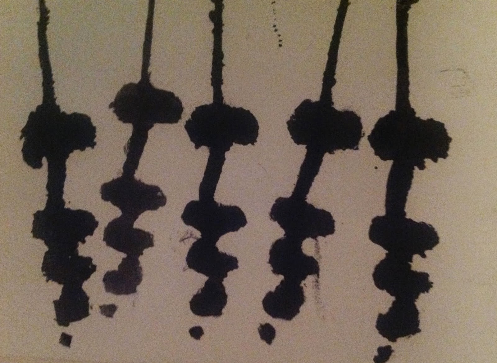
Wax resits method
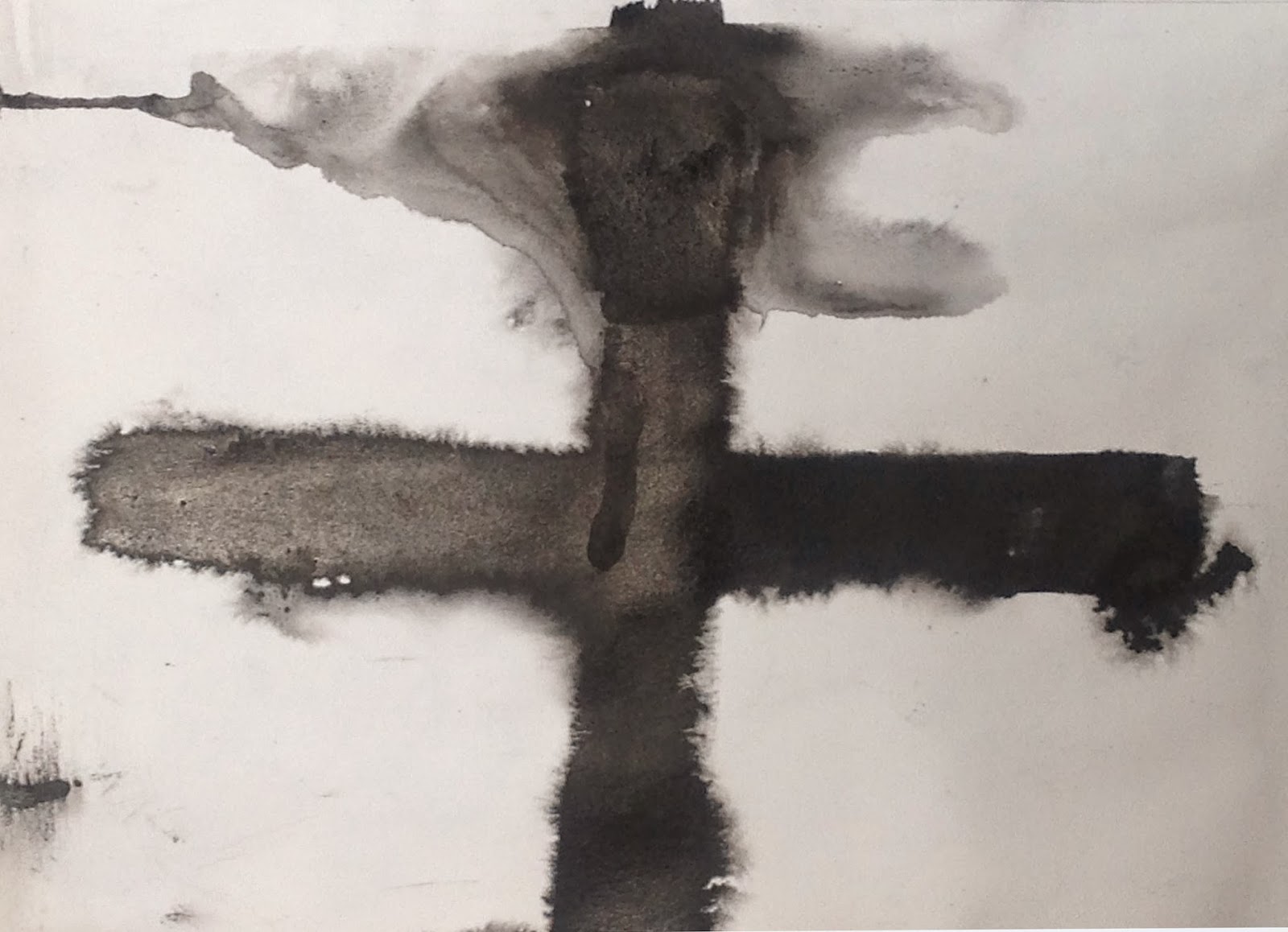
Wet on wet method
Varigated wooden comb
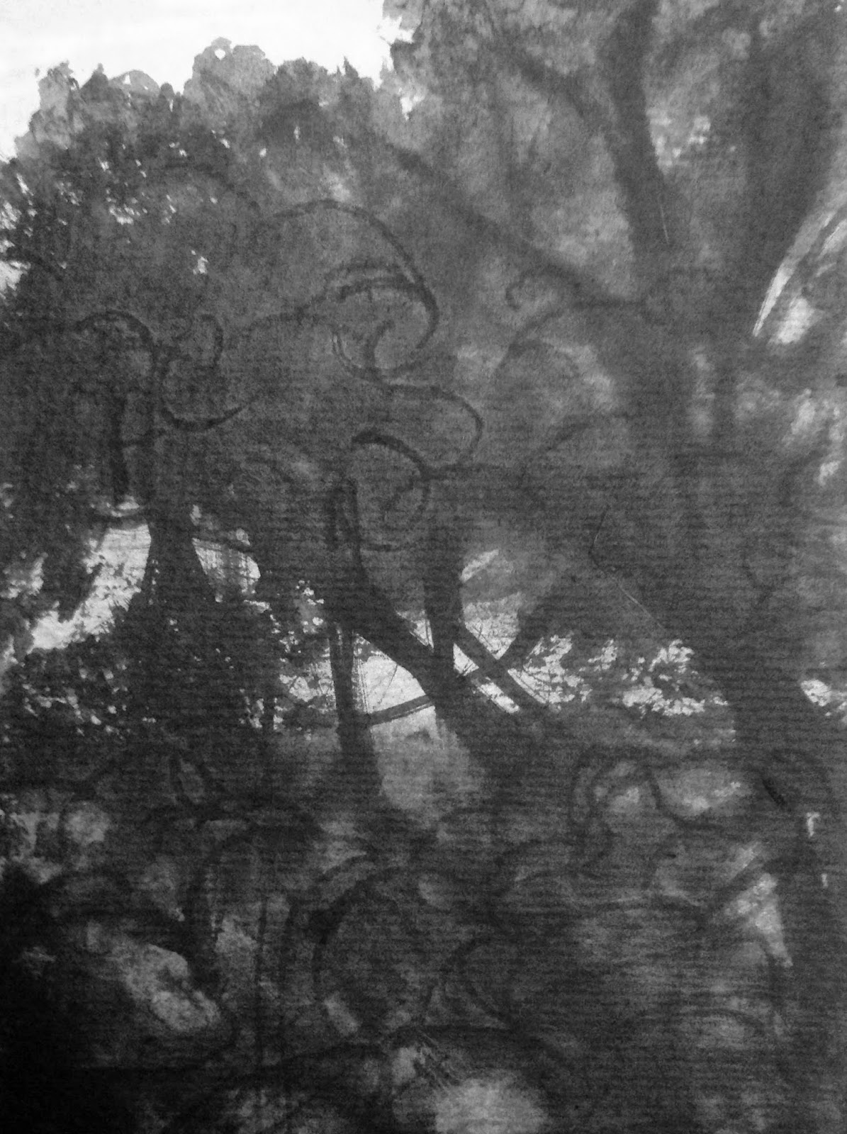
Bark on tree trunk
Wet on wet echoing dimensions of tree
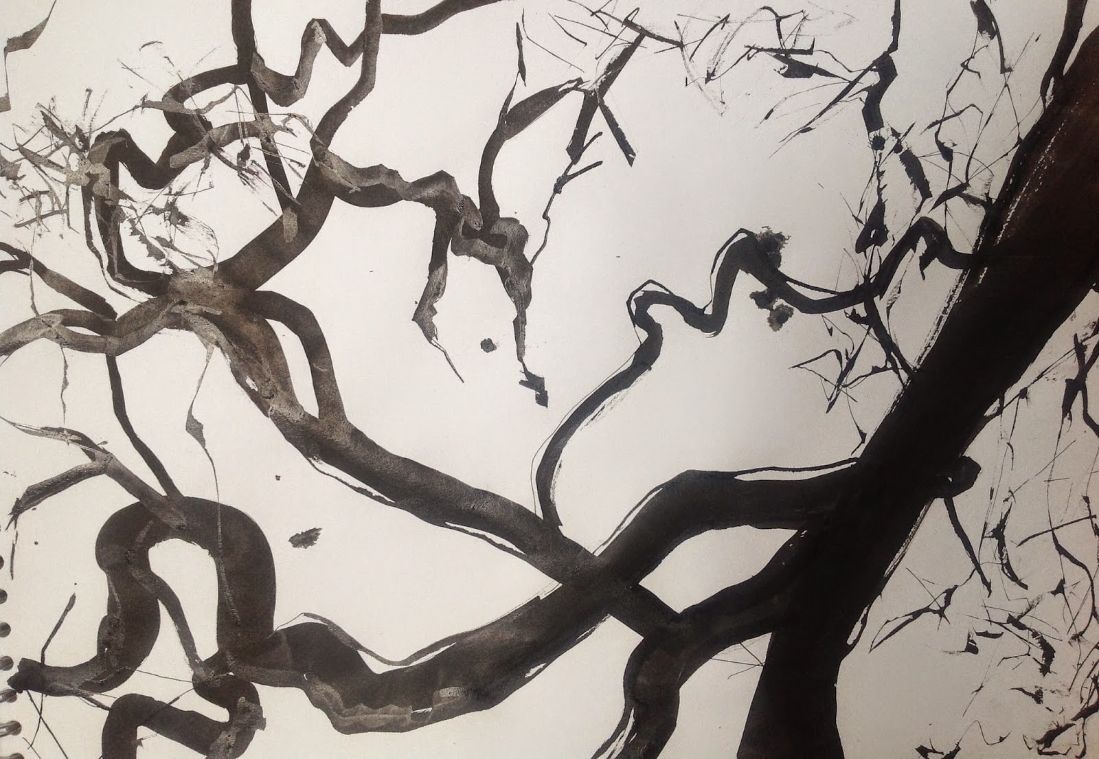
Tree and branch formation using brush and straight edged pen
This is a close up of one of the oak leaf images using combination of ink on wet paper and then a wet wash on left hand side of image. I love the folds on the left.
I was disappointed with my planning when creating images in sketch book, placing four on one page creates confusion. It would have been better to have isolated each image on a separate piece of paper. Also, placing images back to back on sheets of paper was a mistake should I wish to develop individual images in a different way, i.e. cutting and reassembling. Lesson learnt. Having now isolated them in photographic presentation has heightened the different approaches and each now stands in its own space without interference and detraction. I am looking forward to exploring further components using the same media - just wait for the acorns, the whole tree and perhaps the root system!