Wednesday 24 April 2013

Been away for a while, lots on and suffering some sort of tummy bug.  A wee bit of an update on preparing work for end of year exhibition.  Able to get boards cut at Sainsbury's Homebase which provides a cutting service FREE OF CHARGE.  Very obliging cutting to exact sizes.  Prepared boards with two layers of gesso and then applied first layer of oil.  This is a journey!  No knowledge of oils apart from my experiments with oil on paper which I love.  Oil on board works in a totally different way - it creates a totally different surface, there is not sinking which creates that lovely soft, velvety surface when working on paper as it remains on the surface and it is taking a long time to dry - I want to get on and hope that it loses some of the shine as it dries.  It seems as if the moment of creativity is passing while one watches the paint dry - maybe this is not for me.  Yes, I have reverted to type and planned - scale and number of boards and have a concept to work too.  It continues to be linked to the significance of the silver bracelet, brought back from Italy and given to my mum by my father during World War II.  The bracelet has many connotations and is a very personal item thus making my final project all the more poignant to me.  I have a comprehensive sketch/note/reference book as well as a wealth of material produced using different media in relation to the object.
Below are just a few of the sketches which I have produced as a starting point for my final piece(s).  My options are still open and a final decision has yet to be made.

The 'ghost' landscapes are of Italy during the second world war.  The imagery reflects the past and present, the unknown and the known and uses repetition of bracelet links to represent a journey.


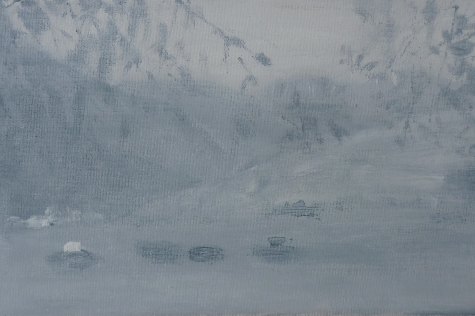
The sketch above is oil on board and painted on a small scale but accurate in its proportions to the proposed larger work.  The landscape has been abstracted and one link of the bracelet has been introduced along with the dates of birth of myself and my two brothers.  The top one is in a dark monochrome palette (the war years), the second mid tones (post war and my birth date), 47 is also the periodic number for silver and is significant as the bracelet has now been given to me as a gift from my darling mum for my 60th birthday.  The third image references my youngest brother who was one of a twin, hence the divided board. In addition to this I have played around with the idea of introducing some text - however, my intention is to keep things simple - constantly reviewing! 


Today I have revisited some print work which I produced a few weeks ago using silkscreen process. These are abstract landscapes and although they are relatively small they have a freedom within them that I seem unable to produce with paint.  I am also in love with the tone of greys used - quite beautiful.  They are like black and white film stills.    There are five in all and I am currently experimenting with the bracelet forms above with the view to creating another layer over the top of them. These could be presented as a seriesof work.
As a comparison, the 3 oil boards lack depth and resemble a more battleship grey, which although could be seen to be aligned with the concept I am not happy with, plus they are still not dry! Oils may not be the way forward for me, not immediate enough, curtails the creative impetus.


Wednesday 10 April 2013

Pilot Workshop on Repetition equals Difference


Exerpts from REPORT AND EVALUATION ON WORKSHOP REPETITION EQUALS DIFFERENC


A pilot workshop was arranged for 3rd April and 6 students attended (4 children and 2 adults).  The aim of the pilot study was to assess the practicalities of delivering the workshop as well as assessing the criteria of aims and objectives.  The group consisted of children aged from 10 – 15 years old plus two adults (one artist and one non-artist).  The workshop took place in my home which restricted the number of participants due to amount of space.
A  PowerPoint Presentation comprising of 14 slides was shown to the students.  This showed examples of repetition by  a variety of artists working in different media.  In addition examples were shown of how repetition can be seen in other areas of design and within nature.   The PowerPoint Presentation was received well and the visuals stimulating generating lots of questions and discussion.
Abigail and Ann monoprinting
The workshop was very successful in its aims and objectives.  The students were made aware of how repetition is all around us, of how it is part of life and can be perceived in a multiple of forms.  The use of different media to explore this area of investigation provided variety and maintained the interest of the students.  It is one of the simplest methods to use in considering repetition equals difference as focus was on the drawn line.  As the workshop progressed other ideas of repetition were introduced by the students thus extending the enquiry. This provided an opportunity to produce 7 images of the same object using different media and applications.

In this workshop one approach has been used to explore this particular area of study.  Further workshops could be devised using different forms of repetition i.e. object, shape, colour, motif to investigate the applications in art, media, nature, industry, commerce etc. 
This is the second time that these four children have 'helped' me.  A big thankyou to you all.  I hope you enjoyed it as much as I did.  Congratulations on producing some fantastic work.  Thanks too to Ann for stepping in at the breach.

Some examples of work produced by students is shown below.

Lion monoprint drawn from memory by Abgail

Japanese lady brush and ink by Andrew Age 10
 
 
Ink blot original drawing of bracelet links by Jane
What a lovely surprise - two ladies!!

Fish Monoprint negative and positive by Ann

Birds using mixed media by Evie Age 12

Bird using ink and brush by Ruby Age 14

Lion on tracing paper laid over terracotta tiled floor by Abigail

 
Bracelet ink and brush by Jane

Chinese vase by Andrew age 10
I WISHED I HAD CREATED THIS IMAGE


Monday 1 April 2013

SUTRA - a dance performance extraordinaire


A visit to Cardiff provided an opportunity to see this very innovative dance performance.  I was unaware at the time of how it would link in with my current research - a bit of a result!

Using another media to explore and utilise the concept his performance linked in with my area of investigation re REPETITION EQUALS DIFFERENCE.

SUTRA a dance event held at The Millennium Centre in Cardiff was a collaboration between the dance choreographer Sidi Larbi Chrerkaoui and Anthony Gormley, our own home grown sculptor (Angel of the North) and 17 practising Buddhist monks from Shaolin Temple in China.
The monks practice a very strict Buddhist regime with Kung Fu and Tai Chi martial arts forming part of their daily lives.

Anthony Gormley's stage setting comprised of 21 wooden boxes which were carried and pushed around the stage by the monks, becoming walls, boats, beds, skyhscrapers, toys and temples. 
The show was exhilarating in its athleticism,  agility, the daring of the monks, yet contemplative and mesmeric with a background of music which emphasized the aura of a compelling ritual where repetition was used in a beautiful, unique and very effective manner. The visuals were stunning, pure, 'understated' form, both in shape and colour creating great focus for the audience. One hour passed quickly, yet was adequate time to become engrossed with the performance and the atmosphere created within the auditorium.  Anymore would perhaps have been overload both for the audience and for the monks whose physical stamina was a test of human endurance and discipline.