Tuesday 27 October 2015

EXHIBITIONS and studio work


My work is currently showing at the Black Swan Open Exhibition and the Greenhill Cottage Gallery Southwick.

Please see links below:

http://www.blackswan.org.uk/

http://www.greenhillcottagegallery.com/

Here are a few recent sketches, experimenting with different processes to represent the tree. 


Tuesday 20 October 2015

Studio Work 19th October


A good amount of time in the studio which is somewhat of a rarity these days as external commitments have priority.  
I worked sitting on floor direct onto a big 'plate' which was not such a good idea as full of aches and pains the following few days.  The first image was made referencing a sketch I had made which on reflection was not a good idea as I felt the image was too prescriptive, rigid with hard edges, lacked any mystery - pretty picture, lacked spontaneity.  Positive comments are quality and variety of marks which were made using various 'tools' for moving the ink around and good contrast of lights and darks. I feel that the 'Eastern aesthetic' is not so well represented here.


The image below I worked direct onto white cartridge paper with ink with much the same outcome as one above. The small single spiral on the trunk of the tree is a celtic symbol. (This perhaps needs to be made using a broader line).

single spiralSingle Spiral - The single spiral is one of the most common symbols of the Celtic culture. The spiral was actually the figure that had the spiral folds of the same line. This symbol stood for the radiation of ethereal energy. There are however many different meanings of the single spiral. Some of the most prominent ones are, birth, growth and death, or expansion of the consciousness, its perseverance and knowledge.


The third image was very spontaneous. Experimenting with a few washes and strong marks using water based ink on paper which I then worked over using oil based ink . The initial ground was rather dark so end result lacked contrast. - could work back into to lighten area beyond the trees to give more perspective and indicate light beyond the branches- some light coming through on the right hand side of the image.  Figuratively it presents a wood of trees stripped of their leaves which now lie in a dense carpet on the ground below.


Residue marks on plate of first image evoked a much stronger response for me, much more atmospheric and mysterious narrative with the form of the tree being shrouded in mist.  An additional small plate was inked up and marks extended in various areas.  The following five images are photographs of the plate.


Final two images are photographs taken during cleaning up of plate and working back into residue oil. Simple vertical wiping of plate and then quick mark making using finger to remove ink which produced a simple atmospheric image.  
The residue marks I feel reflect more of a cross cultural aesthetic.


Wednesday 16 September 2015

Experiment referencing Colin Crumplin Dyptych


Using Colin Crumplins approach of making work I painted random marks on Japanese paper using oils.  The paper was then folded and a print produced adjacent  - the butterfly technique.  Further paint was added and the process repeated.  
The idea is then to seek out some form within the image that corresponds to another 'found' image.  In this instance the strongest link for me was fighting crows.  An image was sourced and I then produced a scaled up drawing from a photograph of two fighting crows.   These were then cut out and placed underneath paper and a print made by passing the roller over the paper.
It was a first and not particularly successful outcome.  Not enough variation of shapes, tone and line in the top image and lack of clarity and definition in the image below.  This could work better using thicker paper cut outs of the crows - it is all a bit messy and does not present the distinction and delineation of imagery in relation to the reasons why and to what purpose work is created in this manner.  
Also, this way of working would be unable to remain within my area of study into the oak tree due to the process.  Still deliberating about this approach in relation to my practice and subject area. 


Acorns 1991 by Colin Crumplin

Method of working

After covering half the canvas with acrylic paint by hand, he then flips over the uncovered portion to form a blind mono-print (the equivalent of a child's butterfly ink blot). The resulting marks are then 'read', (think of patterns left by frost on window panes, or tea leaves at the bottom of a cup) and the image suggested used as the starting point for a new painting in oils. These embryonic 'beginnings' are photographed and carried around in a small notebook like precious intimate objects until they 'speak' to him. A second canvas often the same size is then stretched and an image suggested by the first projected onto it. This may have been found in a picture library, a magazine or simply by a chance thumbing through a random book, or be a photograph taken by himself. Unlike its expressionistic and playful d oppelganger , the second 'hyperreal' painting is executed in meticulous detail in oil -the paint of artifice and illusion -rather than quick drying acrylic. The two halves set up a dialectical tension as if between the left and right sides of the brain. A series of oppositions is established; a dialogue between the cognitive and the intuitive, the primitive id and the civilising super-ego, the fluid and the constructed, the child and adult. It is as if each half needs the other, as in any good relationship, to become more than simply itself. 


Print taken using polysterene disc scored with a ballpoint pen.  

Tuesday 1 September 2015

Exhibition

RECONNECTING TO NATURE IN A VIRTUAL AGE

An Exhibition showcasing my latest work
First-View Gallery  Spread Eagle Yard   Stourhead
3 - 13 September 2015
11 - 5 Daily


http://www.first-view.co.uk/

https://janeeaton1947.wordpress.com/

Tuesday 18 August 2015

Experimenting with oil AGAIN

It has been a few months since setting back in the studio.  Although I have continued with the ink studies and now have 40 Exercises in Style of the Oak leaf and one additional tree study which now brings the total to 91!  I have made a selection of these to produce as greeting cards and await the proofs.
Managed a few hours last week and a good part of yesterday messing about with oil monotypes on rice paper.  I need to familarize myself again and learn more of how the media works with different additives, i.e. oil and turps.  Working direct on the plate with oil and pushing it around still remains very much hit and miss in respect of the quality of image. However, the process always wins the day and results are unexpected which makes it exciting.  I love the unpredictability.


Lifted first print above and then wiped ink away and then worked back in.   I am pleased with the result and would suggest that it represents an abstracted pot of flowers. Use of turps created good and varying shapes.  A good range of textures and contrast.


Smaller works experimenting with different approaches to making variation of textures.


Vigorous, very free mark making produced in a very short time.


Trying to hard, rather controlled.  This was my first attempt from last week. Too much going on!


This last image created solely by residue oil marks that remained whilst in the process of cleaning plate. A small work which is a wonderful example of the unexpected outcomes when working with this process.


Worked over this with oil after print lifted.  This image is rather decorative and shapes reflect Tree of Life image which was a Monoprint Etching.  Repetition, variety of texture and tone are represented. This is the most 'finished' work I have produced as yet.

https://janeeaton1947.wordpress.com/


Wednesday 13 May 2015

Evaluating Presentation 'Reconnecting to Nature in a Virtual Age

Working on my presentation became quite intensive due to three strands of enquiry I had undertaken.  It was important to validate and make connections within the three processes;  to make links from one slide to another.  There were pros and cons to consider. It could have been more straightforward to focus on just one process, thus refining one area and presenting a more fluid and consistent presentation.  On the other hand I felt this was not a true representation of my years work. Presenting each strand in chronological order provided a framework and structure.  However, there was a danger of overload of information which could appear disjointed and confused. Each approach had its constraints and drawbacks.

My extensive research also revealed a wealth of amazing artists that linked to my practice.  The criteria of the presentation with its number of slides, number of artists, time limit was challenging and I had considerable sifting through and pairing down to undertake.  As all my work had been produced in monochrome I used this approach in my Presentation which gave it a uniformity.  I was not confident enough to deliver verbally without referring to my notes which may have made it rather static and lacking in spontaneity. The arrangement of equipment and screen was not conducive and made it physically very awkward to see the projected images.  Equipment should have been placed to the right of the screen and on reflection I would have preferred to stand and deliver!
Unfortunately I ran over time and my last few paragraphs were excluded.  I was disappointed as, although not crucial to the presentation they contained and gave explanations and summed up my use of cross cultural aspects both in regard to the process and the final presentation of my work in frottage. I was able to summarise in a limited way and on reflection felt the Presentation  engaged my audience throughout and was of a good standard both in visuals and content.

It was a valuable exercise from many aspects, making and defining choices, theoretical analysis and comparison, design, format, clarity of images, typeface etc.

Excerpt from text accompanying last slide:

"This final process using frottage has a simplicity where nature is presented directly and not through a filter of language or image.  Michelle Stuart suggests that it is work that transcends what one starts out to do and is somehow transported and takes on a life of its own.  It denotes a physical presence which offers the viewer a more extensive opportunity to make their own own layers of meaning and interpretation.  Hopefully, it does not leave them feeling bewildered, frustrated and empty but somehow more gratified and identifiable with a time and place.

This simplicity can be perceived as having a more spiritual aspect with its non-intervention of the intellect".

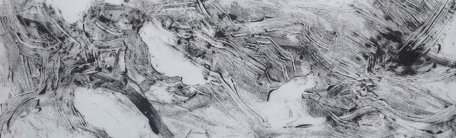
The image below is a frottage taken direct from the ground.


'I WOODSTOCK NY'  Michelle Stuart 1973  Frottage 144 x 62 inches

The image below has been created using an intaglio frottage process where earth and rock have been applied to the surface of the support.


'5 MORAY HILL' Michelle Stuart 1973 Intaglio Frottage on Muslin backed paper. Size unavailable.


These two images below have been put forward as my final selection for End of Year Degree Show.


Apparition I (Oak Tree Diptych)  Jane Eaton 2015 Presented Kakemono format. Graphite on Paper, Wax and Ink on Paper.  Frottage  each 420cm x 56 cm


Apparition II (Oak Tree Diptych. Jane Eaton 2015. Presented in Sutra format. Graphite on Paper. Wax and Ink on Paper.  Frottage each 340cm x 56cm.


Tuesday 12 May 2015

Residue and random marks

Turning pages and making discoveries.  I had made some quick sketches of some twigs with leaves that were relevant to some tree frottages created for inclusion in my sketchbook. I couldn't identify the specific trees so thought I would draw them so as to have record for reference and establish name of tree.  Using a permanent marker pen I drew the three sketches below:


The drawings below are bleed through images created by use of black marker pen on matt absorbent cartridge paper.  The residue rendition has a much more expressive and delicate approach, the harsh lines of the direct drawing are not represented.  These are alive, not static, they echo the transience of nature, fading away, some elements faster than others.


I have also included some photographs of tree blossom that has fallen onto the pavement.  Chance and random where and how they fell,  I had first seen them when the pavement was wet which provided a much stronger contrast.  Photographed in dry conditions, separated from the tree yet presenting a different perception of beauty, fragile against the man made materials.


Thursday 7 May 2015

Concepts for further exploration


On revisiting research on Colin Crumplin I discovered this image which directly connected to both subject matter and the element of the chance mark which has been so significant and an integral part of my three processes. 


Acorns 1991 Colin Crumplin Acrylic paint and pencil on paper 56 x 70 cm

This image particularly resonated with me re subject matter ACORNS!  This presents two distinct approaches to making a work.  1) the top half of the painting is a blind monotype created using acrylic. One side is painted and then it is folded so as to transfer paint to opposite side, thus producing chance and random marks.  Crumplin then photographs the work, carrying the photograph around with him until he finds a second and complimentary image that relates/echoes elements of the first.  2) Another painting/drawing is then created using a much more academic and traditional approach to painting. This is then presented as a whole (Diptych).   By presenting these images together considerable discourse is opened up and the work can be interpreted on many different levels. They involve chance, selection and editorial intervention.  Chance and choice are yoked together to create the inherent tension within his work  It could be suggested that the juxtaposition of the abutted images reflect the eclecticism of a post-modern culture where objects are merely signs, none with a greater value or weight than any other. 


Frankfurt 1945 Colin Crumplin Acrylic and oil paint on canvas 51 x 30cm


Below are some images created using Photoshop combining images from my various strands of work. These present experimental formats and use of imagery 'Hommage a Crumplin'!


A Triptych using from top to bottom, section of oil monotype, ink drawing of bark and pencil drawing worked from photograph.  


Top - section of oil monotype with continuous line ink drawing below


Top image cropped oil monotype, below my photograph edited in Photoshop to present as a painting.


Mono chrome version

This presents an exciting and two fold way of working.  I am drawn to the combative elements with such distinctive and individual approaches, one to include the choice and random mark and the second that offers choice both from found/sourced imagery and the use of media utilised  It presents multiple choices in the second part.and extends the viewer's interpretation on many different levels. - which is more valued? Can it be valued individually or only as a whole?    


Monday 30 March 2015

Presentation concepts for 'painterly' monotypes

Thirteen 'painterly' monotypes were placed side by side in cylindrical form directly on the floor in descending height order from left to right.  They each suggested glimpses of the landscape inviting the viewer to examine on a more intimate level. On reflection, placing on the floor rather defeats that suggestion!  The number 13 bears no significance  in this context and just represents the amount of monotypes produced.  These have all been printed on handmade Japanese papers and unfortunately are not good quality clean edged prints.  I am going to photograph all in a studio setting with the view to having a couple printed for inclusion in my portfolio. Should I wish to use this presentation format in the future,  all originals would need to be professionally printed so as to have good, clean white borders. 

Various numbers of monotypes were placed on the plinth. Once again, 'less was more'.  Using one image and curling the two ends in towards each other  presented a continuous circular view and also added a new dimension.  I felt this was more successful as a 360 degree visibility gave access to the complete image.  In addition the narrative could be extended directly to the shape of a tree trunk  as well as the significance of the circle in Zen Buddhism.  Each image is unique and can be exhibited in isolation.  .
When displayed in this vertical, cylindrical format the printed monotype can be perceived as tall ceramic vases.  I like the concept of printing the designs onto white china/porcelain pots which could be pieces of sculpture, alternatively vases for displaying flowers/plants. (One of the concepts I had considered at the onset of the project with the view to the work having a duality of purposes - printed canvas deckchairs with black wooden frames used or displayed in a domestic interior/outdoors in the summer months). The majority of the works have been created using a long horizontal format, so could not be used in their entirety as designs on deckchair covers unless cropped to vertical shape.


Below, is one image with ends folded in, viewed from two sides.  This presents a strong form, although the paper is light in weight.  As mentioned above the cylindrical shape changes where the two ends are folded in on one another - one becomes two!