Monday 30 March 2015

Presentation concepts for 'painterly' monotypes

Thirteen 'painterly' monotypes were placed side by side in cylindrical form directly on the floor in descending height order from left to right.  They each suggested glimpses of the landscape inviting the viewer to examine on a more intimate level. On reflection, placing on the floor rather defeats that suggestion!  The number 13 bears no significance  in this context and just represents the amount of monotypes produced.  These have all been printed on handmade Japanese papers and unfortunately are not good quality clean edged prints.  I am going to photograph all in a studio setting with the view to having a couple printed for inclusion in my portfolio. Should I wish to use this presentation format in the future,  all originals would need to be professionally printed so as to have good, clean white borders. 

Various numbers of monotypes were placed on the plinth. Once again, 'less was more'.  Using one image and curling the two ends in towards each other  presented a continuous circular view and also added a new dimension.  I felt this was more successful as a 360 degree visibility gave access to the complete image.  In addition the narrative could be extended directly to the shape of a tree trunk  as well as the significance of the circle in Zen Buddhism.  Each image is unique and can be exhibited in isolation.  .
When displayed in this vertical, cylindrical format the printed monotype can be perceived as tall ceramic vases.  I like the concept of printing the designs onto white china/porcelain pots which could be pieces of sculpture, alternatively vases for displaying flowers/plants. (One of the concepts I had considered at the onset of the project with the view to the work having a duality of purposes - printed canvas deckchairs with black wooden frames used or displayed in a domestic interior/outdoors in the summer months). The majority of the works have been created using a long horizontal format, so could not be used in their entirety as designs on deckchair covers unless cropped to vertical shape.


Below, is one image with ends folded in, viewed from two sides.  This presents a strong form, although the paper is light in weight.  As mentioned above the cylindrical shape changes where the two ends are folded in on one another - one becomes two!


Photographing and Evaluating Presentation Concepts- Frottage

Saturday 28th March - a day spent in the Flexi space at Dartmouth Avenue in order to experiment with presentation concepts.  It is a good clear space with white walls and few windows.  There were two free standing lights which were available to use.  I took a few photographs using this additional lighting but felt they were not successful and tended to spotlight small areas, create shadow.  The photographs are of a poor quality taken with an Ipad and enhanced in Photoshop Elements.

The emphasis in relation to this exercise was essentially about form, shape and format,  the quality of the photography was not a priority.

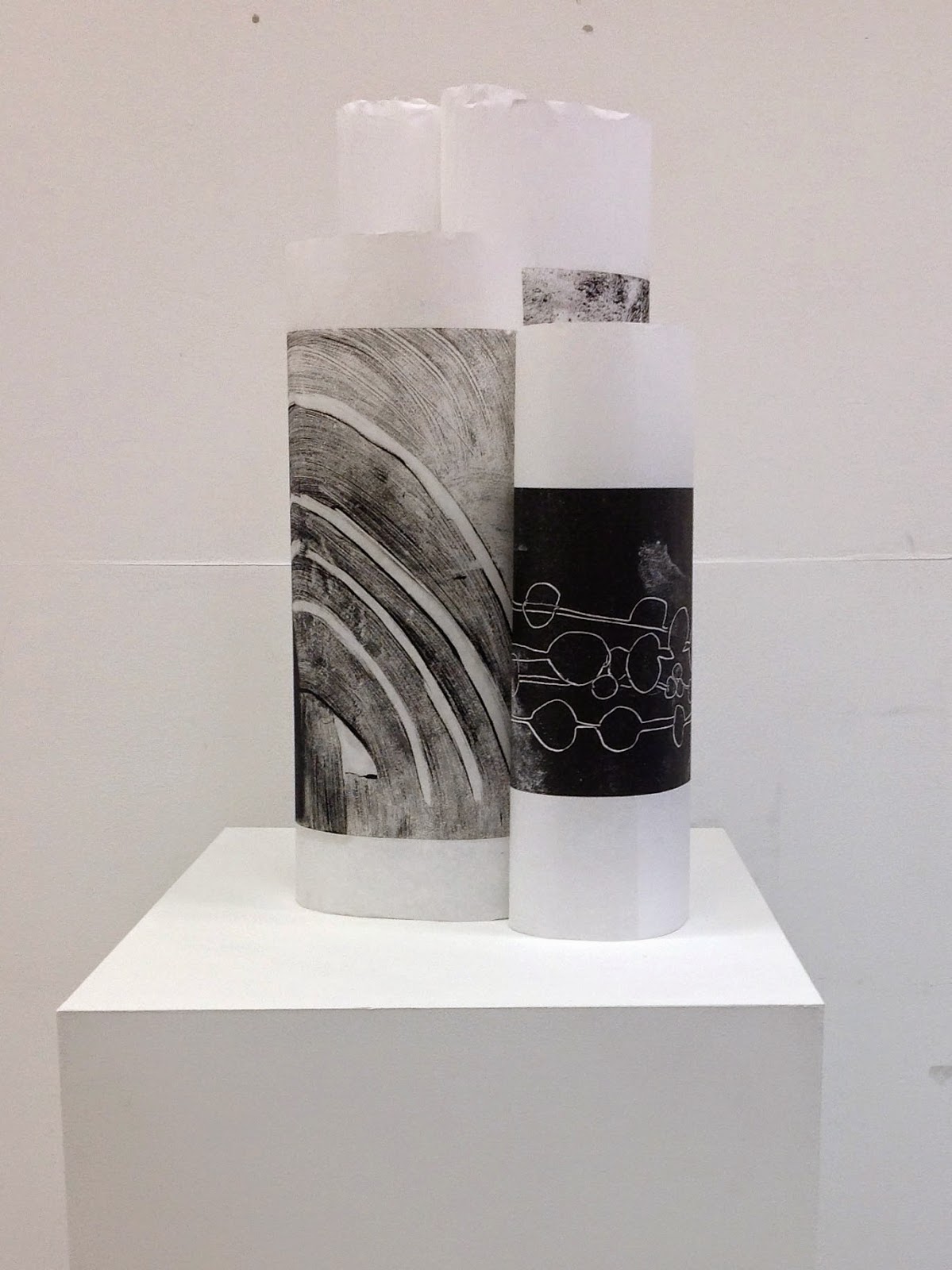
There were six frottages in total, taken from two Oak trees and various papers had been used. Five were made using varying thicknesses of lining paper and one was made on Fabriano white 120gsm paper.  This created a subtle variant in colour and by placing direct on the floor presented an anti-aesthetic giving a perception of being stored as well as having a direct contact to the ground and the horizontal.  I believe the dynamic re storage would change if they were moved away from the wall. Overall, I perceive this as an understated Eastern aesthetic, free of constraints, without status.  The shape reflects the vertical of the tree.  The presentation could further be extended by varying the shape of the cylinders and experimenting with spacing/grouping. When placed on the table the dynamic changed creating an appearance that was less solid and disconnected.


Enso (Zen Circle) and Calligraphy by Rankeisai, Japanese.
18th century (Edo Period). Hanging scroll, ink on paper

The circular shape also echoes the sign of 'Enso', a concept that is used extensively in Zen Buddhism.  It is the idea of the circle or incomplete circle painted in one stroke.  This icon is very prevalent in Japan and is meant to resemble enlightenment, strength, elegance of the universe, and the void or the space that connects everything, it can also symbolize the Japanese aesthetic itself.  The frottage cylinders can be presented with ends folded in reflecting on the incomplete circle.  Here the opening suggest that the enso is not separate, but is part of something greater, or that imperfection is an essential and inherent aspect of existence. It also reflects on the idea of broken symmetry where the principle of controlling the balance of composition through asymmetry and irregularity is an important aspect of the Japanese aesthetic.


This form extended visual perspectives, creating varying heights and a view inside the rolls which could be seen to reflect the age circles of a tree.  Again an anti-aesthetic approach which could be presented on the floor.


 More formats were explored and presented on the table in the above four images.  I felt all of these detracted from the simplicity of form with the arrangements becoming far too complex. Overall they appeared disjointed, uncomfortable - trying too hard to be something else!.


These two frottages have been made using heavyweight lining paper.  Taken from the same mature oak tree the mark making is strong with good contrast. The numerical reference of the number 2 in Zen Buddhism represents our mundane understanding of reality, as reflected in our focus on duality.  There are also "2 Truths", relative truth and absolute truth, the former referring to mundane reality and the latter to transcendental reality. Within Christianity the number 2 is also very significant as with the second creation by God of light - hence dark and light.  The second number of anything speaks and implies the differences that exist. Presenting these on the plinth gave a 360 degree access to the viewer and contained them in a small area creating focus closer to eye level.

                                   
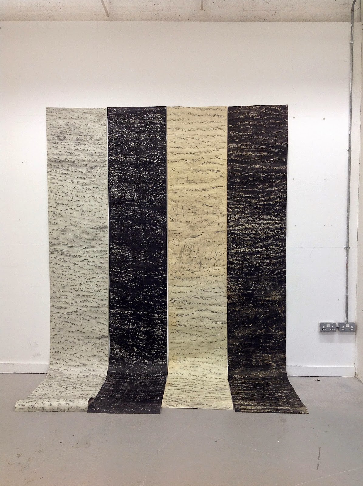
Using four frottages references the significance of the number 4 in both  Zen Buddhism and Christianity.  It represents the four noble truths in Buddhism, the four gospels in Christianity.  In addition creation occurred on the fourth day; there are four seasons, there are four natural elements, four phases of the moon, etc. 
                                  
Hung high on the wall, a vertical scroll interpretation which connects to the ground.  Simple and effective presentation which engages on several levels, i.e. scale, expanse and variance of marks, echoes the vertical of viewer providing a direct physical connection.  This has been a presentation aesthetic used in Eastern art.  Hanging scrolls are known as Kakemono in Japanese and translates as 'hanging object'. They are said to have originated at the time of the Tang dynasty in the seventh to ninth centuries and developed from similar sutra scrolls. Vertical and horizontal scrolls were created in order that they could be easily rolled up and transported. Alongside the geographical of Japan with its high incidences of earthquakes, works of art were less likely to be lost or damaged. They have had strong connections with the Tea ceremony but over the course of history have come to be appreciated more for their aesthetic qualities.
(Space in Japan was limited, they did not have the luxury of huge expansive walls to hang grand paintings or access to oil paints and canvas as in the West. These materials were not introduced until the 19th century when Japan opened up to the West and there was a cross cultural exchange and influence of Eastern and Western art).

Although the four 'scrolls' created an impact by sheer scale I preferred the format of two which was more powerful, four somewhat diluting by overstating - less was more in this instance.


Close up section of hanging scroll.  The left hand image reflects elements of traditional Japanese brush and ink landscapes. These two works present strongest contrast in colour.


Monday 23 March 2015

Oil Monotypes


Whilst I staying with my 'Irish' contingent in Southern Ireland my son-in-law gave me a book to read.  I took it back to my hotel and became so enthralled that I read and made notes until the early hours of the morning. The full content of the notes are on file.  The quote below is by Mike Koostachin, Cree, Cunack, taken from the book titled "We Are One - A Celebration of Tribal Peoples" created and edited by Joanna Eede (2009).

"The trees hold a very special meaning and purpose to all living things.  They have provided medicines for our sick and the material to build our homes. They feed our fires so that we could cook our food and warm our children.  They shade us from the sun, shelter the small animals and birds and most importantly purify the air we breathe and the water we drink.  In return they must be treated with kindness and respect".

This is just one of of many quotes that reiterate and reinforce the importance, significance in relation to indigenous cultures who have survived over millennia on the basis of harmony with nature and its society.  The earth is our foundation, the source of our spirituality as well as our historian and educator.

"I do not think the measure of civilisation is how tall its buildings of concrete are, but rather how well its people have learnt to relate to their environment and fellow man"
Sun Bear, Chippea, USA.

Another day in the studio at home producing three hand lifted oil monotypes, two on Japanese Sumi paper and one on Japanese rice paper.  Introduced my wonderful variegated wooden comb to make marks on the first image.  This is often a spontaneous gesture that once implemented would be difficult to remove.  A good variety of marks in all images.  In the second image focus was on mark making without strong contrast to create a light, more airy interpretation. 
Although the marks are no made purely by chance there still remains elements as one cannot predict the outcome.  There are so many factors involved, consistency of oil, amount of turps used, strength of marks made, pressure applied, reaction of paper - all elements of 'chance' which I feel are both important and relevant in my approach to work, if not crucial. I acknowledge the decorative elements within the images, but is not nature decorative, does it not embellish and provide a rich tapestry if you have the heart to feel and the eyes to see?  It remains a rich typography of the spirit.


This stylised form of the oak tree fascinates me.  It echoes an element of the Japanese sun design and I feel that I have created some perspective in this image.  The tree in the foreground was added after the print was lifted and I had reservations initially as the brush and hand produce a strong contrast to the printed area which often appears at odds and isolated.  Initially, I perceived it as a failure, but on revisiting I consider it works! The image portrays the varying shapes of oak trees which is dictated by their environment and exposure to light.  I have seen oak trees in the woods near Longleat, Wiltshire which present themselves like tall pine trees as they grow long trunks whilst reaching for the light.

I have now produced sufficient 'painterly' monotypes to experiment with presentation concepts in the Flexi Space at Dartmouth Avenue next weekend. These will be recorded and placed on file for reference.

Ink Studies

With regard to the small ink studies I have now attained my goal of producing 10 images of each of the six chosen components of the oak tree.  Below are the final two sets of drawings showing oak flowers and oak galls.  There are now over 60 studies in total.  Consideration has been given to producing 100 images of each component at a later date with each of the six components being produced as an Art Book.  I shall also experiment with presentation formats, photograph and enter on file for future reference. Time permitting, I also aim to scale up one image and print onto watercolour paper.
This process has been an extremely valuable exercise enabling me to observe and draw from life, thus engaging on an intimate basis. The process of experimentation has provided an opportunity to both explore the medium of ink and to utilise a variety of  implements to apply ink on a small scale supports. It has been a challenge to produce different interpretations and I feel they have been successful in extending perception. Some images provide a direct visual identification of the subject whilst others are more abstracted, often representing a single element within the overall construction. Overall, I feel I respond to the more simple 'designs' and also acknowledge the decorative elements within this body of work.
The images each stand alone as an individual pieces of work, In addition they have provided a starting point that can be further extended using various different applications. They have contributed to and increased my awareness of the complexity and wonder of nature.