Monday 26 January 2015

Printing in studio at home

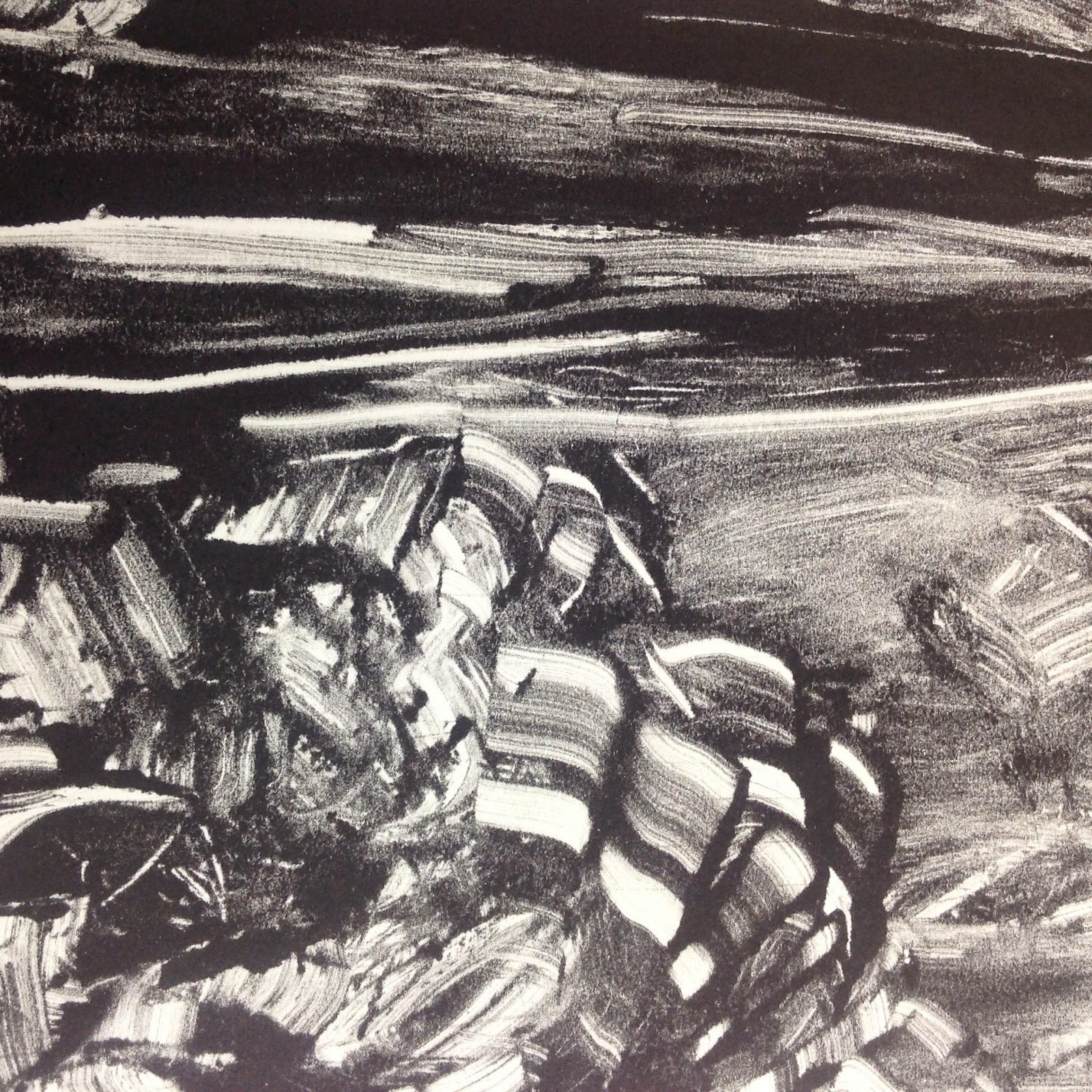
An afternoon in the studio at home was a bit of a challenge.  I am very aware of not having a good stable, firm plate to work on.  It has all been rather inconsistent with 'making do' and utilising what material I have to use for use for plates.  Acetate was suggested as an alternative and I found it produced some  fairly reasonable results.  However, I was not happy working with this material, being flimsy and light in weight, liable to move when applying ink.  In addition the oil slides and is less firm on this surface.  Rooting around in the studio I found some sticky back plastic which I cut to size, making a plate 20cm x 60cm.  Working in landscape format this plate was reasonably stable but the surface did not provide adequate resistance when applying the ink.  Having now experimented with various plates my favoured material is a firm sheet metal.  The ink can be manipulated and pushed around more and it remains secure and stable to work on.  I have requested a metal plate from the Print Studio at Sion Hill so hopefully the lovely technician Jane will have found one for me when I go in to print on Wednesday. Today's images can be seen below.  Again, I struggled with choice of imagery to work but made the decision to stay with trees and branches.  The first image was produced taking two prints and worked from a brush and ink sketch of abstracted oak trees with the branch then being printed on top.  The single branch was strong and effective and the background shapes echoed the shapes of trees.  It was an unusual composition with lots of space to the right of the tree trunk. By transferring the image to a vertical format another narrative was suggested as a path/journey leading to a tree.  This resonated with some text written by Henry David Thoreau (1817 - 1862).

"I frequently tramped eight or ten miles through the deepest snow to keep an appointment with a beech tree, or a yellow birch, or an old acquaintance among the pines".


The image below was referenced from a brush and ink sketch which I had previously developed in print.  This was a second attempt which I felt was less successful. The ink reacted differently on the plate, there were fewer tonal values and the composition a little weak with trees appearing in a row.  I am also having great difficulty in keeping the paper clean and tidy which is very frustrating.  The paper I used was also different to that I had printed on previously with one side having a very prominent lined texture.  At first glance I perceived this as rather distracting but now feel it is not such a failure and can be seen to add interest and cohesion within the composition. There is significant use of repetition throughout the work.  I made two prints, one on the textured side and one on the smooth side.


Below is the image with top section cropped.  I feel it is stronger than the original where the complete trees are represented, but has lost some of the more expressive mark making. 


Reflecting on my previous blog entry showing a geographic field design a new concept has presented itself.  I thought this could be extended by creating a shaped mount of a field.  This would be placed over the plate before lifting a print, thus producing an image contained within the shape of the field and referencing elements of the geographical landscape of oak trees situated on pastures and farmland. The shape could be designed to include the Ogham symbol for the oak tree indicating where each tree grows. 

Experimented with various papers which I had purchased from Print to re work brush and ink sketches.  The mark making appeared quite different, more controlled and the paper buckled.  One good result on creased rice paper using square ended pen and ink - I love the way the ink responds to rice paper.  I will explore this media further alongside brush and ink work on good quality 300gsm watercolour paper.



Thursday 22 January 2015

Print Studio/Week 3

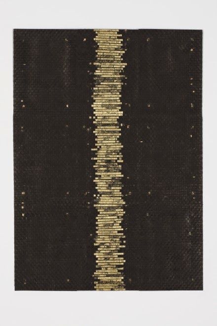
Following on from tutorial with Angie Cockayne my first priority was to examine the variety of paper for print work that were available to buy from the Print Studio.  My focus is to start making some finished work on good quality paper.  For today's exercise I chose a lightweight Japanese paper to print on, first cutting a stencil that represented a field adjacent to my home.  This diagrammatic approach had been prompted by looking at the Indian artist Zarina Hashmi's work (recommended by Mandy Bonnell). This work was very different in style to previous work which has reflected a more romantic and painterly portrayal of the Oak tree.  However, I decided to pursue the concept and perceived  that this geometric format could be extended in several ways. Small images referencing the Oak tree components could be added around the edge, either by printing direct or making small paintings which could be pinned on.  Alternatively it could be used as an anchor work that related to the original concept which had been generated by my walks in the local fields. The stencil was reasonably well cut and clean, but once again I made the mistake of forgetting to reverse the drawing when printing!  Three prints were run through the etching press 1) printed on textured side 2) on the reverse smooth side and a third printed onto a larger piece of paper so as to create more space around edges. The textured side produced a darker, stronger edged print and the smooth side was more muted, resisting the ink more, This softer tone reflected and echoed more with the fragility of the paper.
 
I have reservations as to this very geometric format, yet I am drawn to the concept of presenting two different styles together. Links can still be forged with use of monochrome palette, calligraphic mark making and subject - it can be perceived as bringing together of the sciences rather than separating them - reference here to geopoetics in that everything in the world is connected. There is also the possibility of combining the two styles.  This could extend the viewers interpretation of imagery on more levels - create more questions? All the symbols represent trees, one references the Celtic Ogham symbol for tree, the coffin shape represents ancient oak trees that were cut down during a dispute with local villagers and the tenant farmer who worked the field.  This is an agricultural field that produces several different crops each year and the shape of the field has been dictated by the mature oaks that sit on the perimeter.


The prints were not entirely clean and would need printing again should they be included at end of year Degree Show. Keeping prints clean is always a challenge.

Below is an image by Zarina Hashmi - 'The Straight Path' 2011 Woodblock on Paper


Friday 16 January 2015

Experimental Ink Painting - Two Chinese Artists

I have been experimenting with two mediums, ink and print, both of which can be perceived as traditional materials used within Eastern artistic expression. Ink has been used for painting and calligraphy for many centuries.  It has provided the most extensive opportunity to create a huge diversity of creative imagery over many centuries.  However, the 20th century developed and introduced new media and practices to China and the traditions of ink painting began to be examined and challenged. Experimental ink painting emerged and it is within these realms that I have found several Chinese artists that are of particular interest within my research area. Below are two examples of work by Chinese artists where connections both in concept and imagery have provided links to my area of study.  Other experimental ink artists can be referenced in my research file.

Zhang Jiangun (b1955)


Nature 1987 (Triptych 175 x 288 cm) combines ink drawing and collage 

Zhang explores he richness of ink and is inspired by Chinese philosophy and aesthetics for inspiration.  The image above portrays a recollection of memories of river views in China.


Duan Jiangun (b1970) has worked predominately with oil on canvas but it is her work that was executed in 2008 that interested me.  The image below is one example of a series of monochrome ink pieces worked on flattened cardboard boxes,


Beautiful Dream 7 2008


The imagery reflects a postcard like landscape.  Using a flat silhouette emphasises the picture surface as does the recycled cardboard.  Cliched imagery appears stamped as labels on commercial goods.  This presents different levels of interpretation - traditional motifs, recycled material plus the vulgarisation of spiritual values linked to a Chinese cultural heritage. Duan uses the surface, sometimes torn, creased as part of the composition and like Robert Rauchenburg offered comment on the cheap materialism of modern 'life'.  The embellishment of packaging but without its contents brings attention to the superficial attributes of western culture.  

This is a concept that I could use to present my own imagery,using ink/print.  Creating beautiful monochrome imagery to decorate empty brown cardboard boxes.  This would present on various levels of communication - recycling and environment, card made from wood, cycle of nature, spiritual emptiness of consumerism?  Nature is free/nature can be a commercial enterprise/nature has been devalued/threatened/manipulated/logo/label promoting nature/empty/empty spaces/take a journey,etc. All of these points make connections to nature whilst utilising the materiality to emphasise and provide cross cultural comparisons. The aim and objective being to engage the viewer and create an awareness and reconsideration of the value and enrichment that the appreciation and experience of nature can provide.
.


Thursday 15 January 2015

Printing -Monotypes II


Another full day in the Print Studio at Sion Hill.  On this occasion I had prepared some preliminary sketches for reference.  As there was very little choice in plate size I decided to use acetate as a plate to work on and cut this to size 8" x 18" to be used in a horizontal or vertical format. The acetate responded entirely differently to the zinc plate when applying the oil printing ink with it sliding on the surface. The ink was rather thick and claggy so I added linseed oil to thin - rather too much. The consequence was on running through the press some ink spread beyond the original line on the first print.  I perceive the tree as placed too centrally and the print rather weak in density and variation of line.  It did however, portray the sense of water below the surface and being absorbed into the roots. The Celtic Ogham Oak Divination symbol was introduced within the root system but I had forgotten that it would be reversed in the printing process! This first print was laboured and again worked to the edges - the root system also referenced peacock plumage!  
!

The image below was based on a combination of two previous sketches. I enjoyed the spontaneity and expressive mark making techniques employed.   Some lovely textures but felt that I should have created more pure space - again I filled the whole page and perhaps provided too much information.


Taking a section and rotating the image presented a more dynamic and interesting composition as can be seen below. There are strong contrasts both in tone and mark making with an effective use of repetitive shapes and lines.


The following image referenced a photograph/sketch of the trunk of a tree which had become hollow  Water had collected and then overflowed down the trunk, staining it in dark streaks.  The image was successful in its variety of tones and marks but then presented itself as referencing flowers!


The two sections taken from the above image, once again, provide more engaging and thought provoking imagery in particular the right hand image which offers an effective use of varying shapes, space and contrast.  This is more what I am aiming for.


The image below was created very quickly with the minimum of effort.  One brush was used in a swirling method and then ink lifted out and the Ogham symbol introduced (reversed!)


Less is more and I felt a stronger response to these images.

In this instance I felt the complete image was a more effective composition with the work not going to every edge.


Referencing a brush and ink sketch of oak flowers and leaves I produced a quick and final image of the day.  The complete plate was inked up and then utilizing various methods areas of ink were removed to create this rather representational, decorative and  romantic image.  (Turpentine creates some very beautiful textures).  Again, I feel there is too much information and I have worked to whole of the surface - this is an approach that appears to be rather entrenched and I feel needs addressing.  It is a slow process getting to know materials and how they react on different surfaces.  There is a long way to go, lots more practice and experimenting to producing work that has an integrity and resonates with my aims and objectives.  Often, I feel that I am not sure what it is I am wanting to produce and it is only be continuing to engage in the process that it will be eventually revealed. The Print Studio offers a huge variety of printing techniques and I am asking questions as to whether other processes may offer more appropriate and conducive approaches to making work.


Below is a sections showing the effect of turpentine splashed onto the ink.

Thursday 8 January 2015

Printing - Monotypes


It's been a long time since I have been in the studio and I was aware of a distinct lack of confidence in my approach to creating some 'finished' work.  This was my first experience in the print studio at Sion Hill and it was challenging, not only on an emotional level but also on a practical level.  In the past I have worked with water based printing ink - this studio uses only oil based inks so this has set a precedence and I needed to explore the media and how it responds to painting direct onto a plate and passing through etching press as well as getting to know the environment.

In preparation I had experimented in my studio at home with some hand printed monotypes using oil paint, linseed oil and turps. With no particular referencing to my sketches three experimental images were developed working direct onto a long horizontal perspex printing plate.  This format echoed the cross cultural referencing of my proposal whilst allowing me to be expressive with mark making by painting directly onto the plate.  These were then hand printed onto rice paper. The paper responded well to the mark making. The images progressively loosened up and were less detailed. In the first image everything was there - representational and pictorial.  The second image has a softer and more ephemeral feeling with the mark making on the right hand side being particularly beautiful and detailed.  This composition created more interest because of the more airy space on the left - there was overall a greater variety of mark making, both in density/sharpness and contrast with the composition being understated.  The last image was generated by 'cleaning up process' - using remnants of oil on palette and linseed oil and playing with them on the plate. Tonal values were similar all over and although I responded to the abstract composition I felt it needed developing with darker areas. Overall, it was an interesting exercise in getting to know materials using a figurative approach.  I would like to pare down and simplify imagery but have reservations in my ability to accomplish such an outcome.


The images below, presented in order of creation were made with oil painted direct onto zinc plate and passed through etching press.  Keeping to a horizontal format they were referenced from my brush and ink sketches. I was able to retain a dense black which echoed the Sennelier black Indian ink used in the sketches.  Some of the more detailed brush marks were lost which could be the result of running through the press on dry 150gsm cartridge off white cartridge paper.  I need perhaps to print on damp, heavier paper for more detailed results.


The Ancient Lightening Oak

The following image was worked from imagination, rather decorative but communicates on several levels both in narrative and formal qualities. Could perhaps work better if not quite so central.


Resilience

The following image has been referenced from one of my brush and ink sketch.   This composition with its simple shapes also provide 'a journey' for the viewer. Again, there is a reservation in that the composition is rather central and has been reversed by the printing process.


Untitled

This final work became overworked with heavy use of turps to lighten and block out areas.  Lacking in contrast but useful to see how different effects of brush, ink and turps can produce expressive mark making/patterns.

Boundaries

Outcome:  There is considerable further exploration to be done in regard to materials and printing process.  Dilemma as usual is to choose which outcome to work towards - art book (size, format, studies, text)/fine art images that could be transferred onto 3d objects as per proposal?  Also a question has arisen as to choice of medium.  At present I am recreating brush and ink sketches in print form! Why?  Answer, both these media are directly linked to Eastern traditional materials used in making art. I remind myself that they are two entirely different approaches which both offer a unique and dynamic outcome.

Monday 5 January 2015

Haiku

Having not had an opportunity to get back into the studio to start on some more serious practical work I have at least found time to be creative with words. I have been composing a few Haiku in direct response to my walks in the countryside during November and December. I have used a traditional and common format of 5/7/5 syllables.

Strong high chill still tree
Fluttering blacks weaving
One buttercup glimpsed

Misty milk half moon
Crazy white lined ice puddles
Low dazzling sun

Milky ice furrows
Tread white line crazy paving
Birds and water sing

The two below were in response to the first snow that fell over the hills surrounding the city of Bath

Matisse random white
Paper cuts below black lace
Fan horizon line

White paper cut shapes
Icing sugar furrowed fields
Black fan horizon

The haiku below were created some time ago in response to some small ink drawings.  Presented in book form of 10cm x 10cm exploring the juxtaposition of images and words.  A Japanese aesthetic was referenced for book cover and end papers with designs on cloth and paper using a callagraphic line design. This is an approach that I may experiment and develop further within my practice. Responding to images with words adds yet another dimension embracing and extending our sensibility to a particular work.


White Mountain

High mighty serene
Dark storm descending above
Start straight surface marks


Terraced Fields

Orderly layers
Planting nurturing living
Sun rain life man's marks


Winding Path

Footsteps light soft hard
Intervention on land
Up down straight curved marks

These first tentative steps into creating haiku were in response to nature and man's making of marks on the land.  I do not feel confident in how well they portray a feeling.  These are more about a visual response communicated in words. The response is to the marks of an abstract image, composing and using words which give a more literal and representational understanding .  In comparison my recent poems hopefully conjure up a more emotional feeling and atmosphere that can be related to an experience.