Wednesday, 4 March 2015

Bark Studies - Ink on Paper

I have recently discovered Ellsworth Kelly plant drawings in a book titled 'Drawn from Nature:The Plant Lithographs of Ellsworth Kelly (2005). This is a publication produced in conjunction with a touring exhibition organised by the Grand Rapids Art Museum, published by Yale University Press.
"To know the nature of things is the basis of humanism", "the plant lithographs of Ellsworth Kelly capture our interest and awaken our spirit as we move among them". These are two quotes taken from the Director's foreword (Celeste M. Adams).  Referring to the pencil and ink plant drawings Ellsworth Kelly states:
"In the way that I would draw the plants, they were not nostalgic, not pretty flowers.  My drawings were to meet the eye direct".  
Within my self directed study proposal my aim was to create work that connected me and my audience to nature, to see directly, to engage on a more spiritual level.  Kelly is painting as a Zen painter, where brushstrokes are mindful with the simplicity and purity of line in these plant drawings become objects for meditation.  Although not versed in Zen Buddhism he began the drawings in the late 1940's at at time when Zen popularisation in the U.S. evolved through the writings of D.T. Susuki.  It appears that he was attracted to Japanese calligraphy.  He was aware of Japanese paintings and perhaps intuitively understood their spirit.

"You must not copy nature. You must let nature instruct you and then let the eye and the hand collaborate"  Ellsworth Kelly.  It is about a connection to the lived experience. It is about capturing an essence that when one revisits a drawing the moment and circumstances of their creation returns with great immediacy. They show no detail no extraneous detail which allows for a sharp focus on the single plant for.  It is perhaps an expressive connection to a bridge to the phenomenal world.

Oak III 30" x 36" Edition of 30.  lithograph in Series of Oak Leaves 1992/3


I
In comparison I have made drawings which extend and interpret my close observation of the oak tree and its components.  Each drawing has elements of the element and is a new perception.  They are not about a meditative response more about unique responses to an object - the multifarious ways one can observe and awaken a 'new way of looking, a different language'. I am using the bridge analogy from a different perspective.


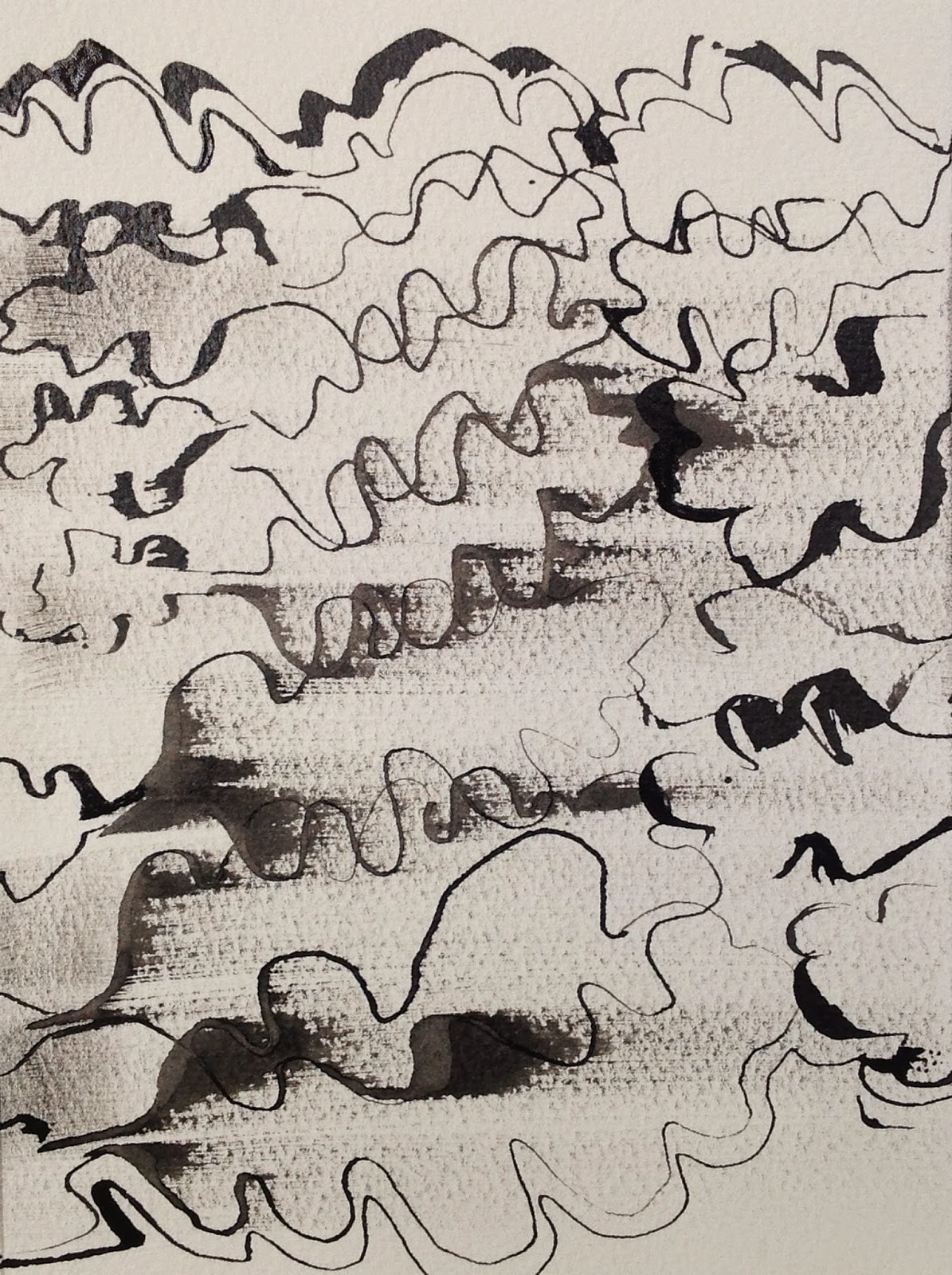
Below are images relating to the bark of the oak tree.  All worked in Sennelier black ink on Somerset soft white textured watercolour paper - each 15cm x 21cm.


Monday, 2 March 2015

Oil and Ink Monotypes

The first three images were produced by painting with ink onto gauze fabric and then transferring to paper. Ink was applied with a loaded brush on the cloth and then immediately laid over paper to produce print.  The ink bled into the cloth on either side of the brush stroke which resulted in a broken line.    'Chance' mark making!   


The images below were created using the same method as above with a second impression made.  This  resulted in a reverse image which was less clear - created a more mysterious image with a different quality of marks.  The combination of the two materials have produced some wonderful textures which would be almost impossible to reproduce using a direct drawing approach.


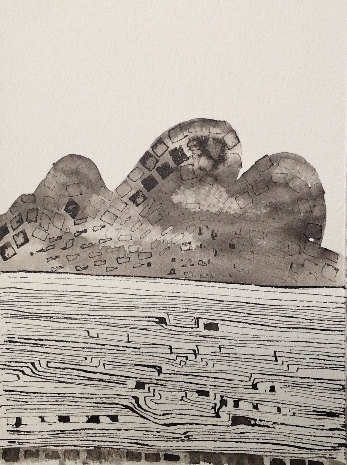
Continuing with the horizontal format two works on Japanese paper were produced in the studio at home.  The first was an attempt at creating a language of the tree by including and hinting at the shapes of the different components of the oak tree within a landscape.  I am aware that I have made a strong connection to the heavy gnarled branches of ancient oaks which with their enormous weight bend down to the ground.  Also included is the strong symbol shape of the oak tree taken from my smaller ink studies. I feel that a language is evolving using both pictorial and calligraphic imagery.  Elements of this first work suggest the traditional landscape themes on Chinese ceramics and scrolls. The painting provides several different narratives e.g.  the irregular line at the base of the picture could be a path, a tree, a river?


Below are some monochrome works by Bernard Piffaretti a French painter who produces 'duality' paintings. I have knowledge of this artist through my earlier research on repetition equals difference and have explored this way of working whilst studying for my Foundation Degree in Applied Arts. 


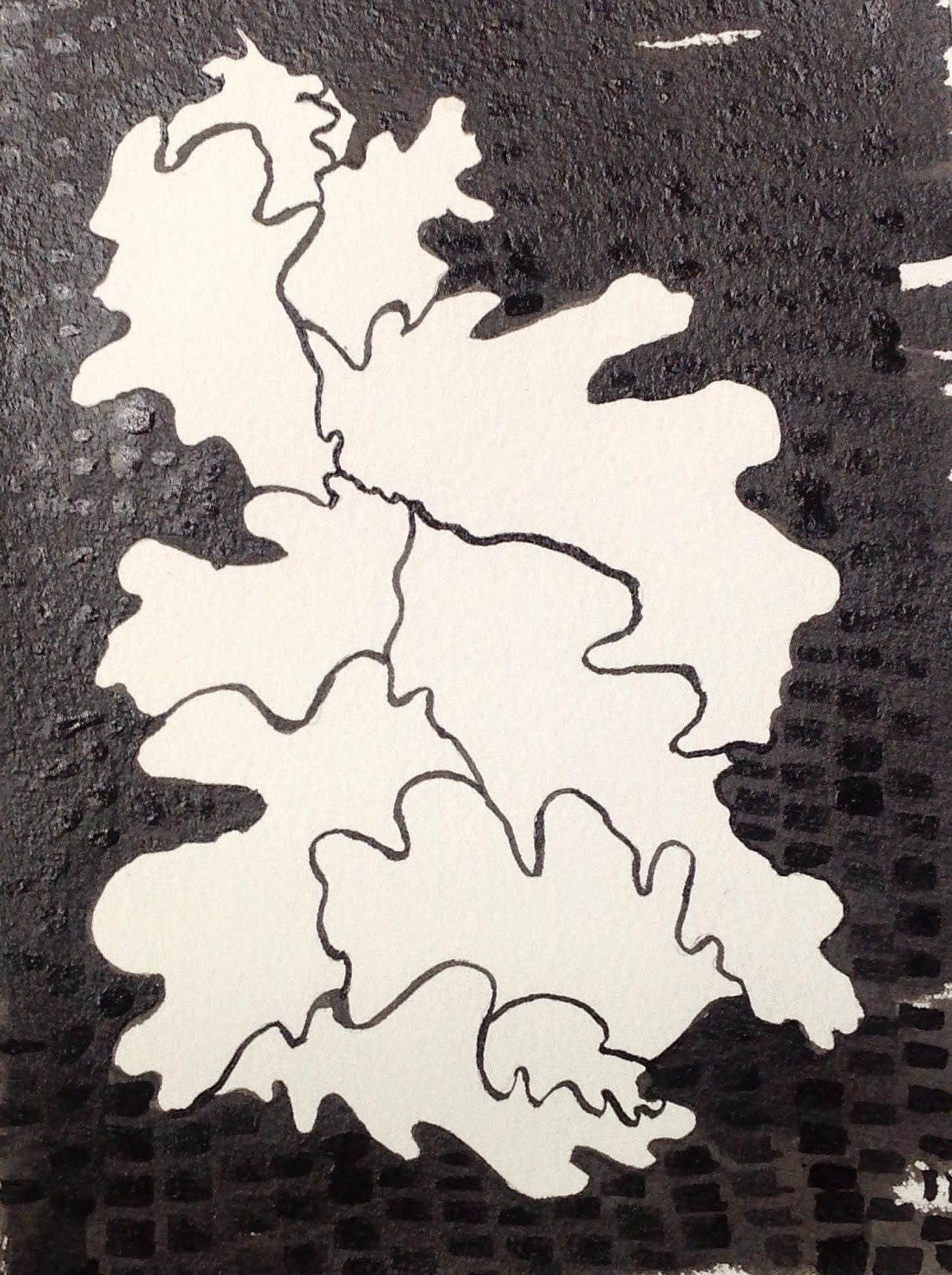
I wished to see what evolved when using this method within a printing process.  The image below was made as a duality work painting direct onto an aluminium plate.  Divided in half, using oil printing ink a line was made down the centre and then each stroke alternately repeated on either side.  The image was referenced from my an early ink sketch.  Strong and bold, ones eye glances from one side to another making comparisons with shapes and marks - an exercise in repetition equals difference - one painting cannot exist without the other using this method.  This could be interpreted as nature itself where duplication and replication always present a uniqueness.  The composition has evolved in four sections, representing the four seasons?Is the tree form reflected in water? Mark making is very varied. The final image has been presented in a horizontal format showing a centre section from the original painting. Can you find the rabbit/hare within the picture?  It is rather like a 'spot the difference' game!


Monday, 16 February 2015

Ink studies and Print

Tutorials are always a mixed bag, extending lines of enquiry both in research and practical application, with each tutor expressing their individual opinions and advice.  Mandy Bonnell (Print Tutor) had recommended looking at a book titled 'Of Green Leaf, Bird and Flower'.  This is a new publication which charts the journeys of Artists' Books and the Natural World.  Mandy has contributed several images and a chapter 'Recording of Nature' in which she writes on the exploration of the book as an Art Form. With many artists contributing written articles that link to their own practice alongside the historical development and presentation of Artists' Books this is both a visual feast as well as providing a wealth of different approaches that artists have used to record and express their perception and interpretation of the natural world.  The book has been produced to a very high standard with excellent photography and reproduction.

Following on from tutorial with Mandy I decided to produce small ink drawings referencing my sketch book as per 'Hommage a Queneau' by Colin Crumplin, an idea which was originally suggested by Angie Cockayne as a method of 'getting to know my object'.   Using Somerset off white textured watercolour paper and ink my aim is to produce an initial 10 images of each individual component, i.e. tree, acorn, leaf, bark, flower and oak galls.  Once complete I will experiment with presentation, format, placement in order to assess and re evaluate. This will provide an opportunity to look at the images together to assess how they work as one piece. Thought has already been given to cropping, resizing and reproducing images using alternative print approaches, i.e. woodcut, photo etching but realistically I feel that time is a constraint and that focus should be maintained around these ink drawings alongside my more painterly monotypes.  I have in mind to perhaps produce an Artist Book using an innovative presentation but must confess to reservations around this concept.


My attempt at a cubist style image of acorn.  Mark making is quite prescriptive and controlled.  It is an image that resonates with my aesthetic 'eye' with fine line, dark shapes and overlaying of imagery The varying scale and views all contribute to an interesting composition. I plan to crop this image to form a square shape which will perhaps emphasize and introduce the juxtoposition of two geometric shapes and emphasize the form of the acorn.  


A very quick, freely painted image which presents some expressive and beautiful mark making..  I had initially seen it as a failure but on revisiting it proves to have some great qualities, There is a freedom within the mark making, repetition both on vertical and horizontal planes with lines breaking up and different distances apart.  It has a quiet perspective with varying proportions of tree form and a good contrast of tonal values. I would like to reproduce this on a larger scale but find spontaneous results a challenge to reproduce!
I consider this a successful composition and strong piece of imagery. 


Saturday, 7 February 2015

Early 'painterly' monotypes


Whilst researching the history of monoprints and monotypes I came across these very expressive, painterly prints by Frank L. Emanuel (1865-1948). They both capture and present a powerful emotive connection to the landscape, moving away from the figurative to abstraction.
He was a lover of traditional art and very much opposed to modern trends in the art world so these two works stand out from his usual representational landscapes, portraits and interiors. Studying in Paris during the late 19th century he would have been aware of other painters working and experimenting with this approach.

Edgar Degas exhibited his monotypes in the third Impressionist exhibition of 1877 with several artists becoming interested in this form of art thus giving printmaking a status as a result of the creative and spontaneous use of the media. Many artists of this period adopted and adapted this method of working,- Camille Pissarro, Paul Gaugin, Pierre Bonnard, Pablo Picasso, Chagall, Miro, Dubuffet and Matisse amongst them. A common name for them during this period was 'painted drawings'.
It has been suggested that artists experimenting with this type of printing technique were influenced by the early developments of photography with its black and white contrasts and interplay of positive and negative imagery.


'A lowering Afternoon' Monotype 1920 153 x 202mm


'Moonrise over the Sea' Unfinished Mezzotint. 153 x 201 mm.