Monday, 16 February 2015

Ink studies and Print

Tutorials are always a mixed bag, extending lines of enquiry both in research and practical application, with each tutor expressing their individual opinions and advice.  Mandy Bonnell (Print Tutor) had recommended looking at a book titled 'Of Green Leaf, Bird and Flower'.  This is a new publication which charts the journeys of Artists' Books and the Natural World.  Mandy has contributed several images and a chapter 'Recording of Nature' in which she writes on the exploration of the book as an Art Form. With many artists contributing written articles that link to their own practice alongside the historical development and presentation of Artists' Books this is both a visual feast as well as providing a wealth of different approaches that artists have used to record and express their perception and interpretation of the natural world.  The book has been produced to a very high standard with excellent photography and reproduction.

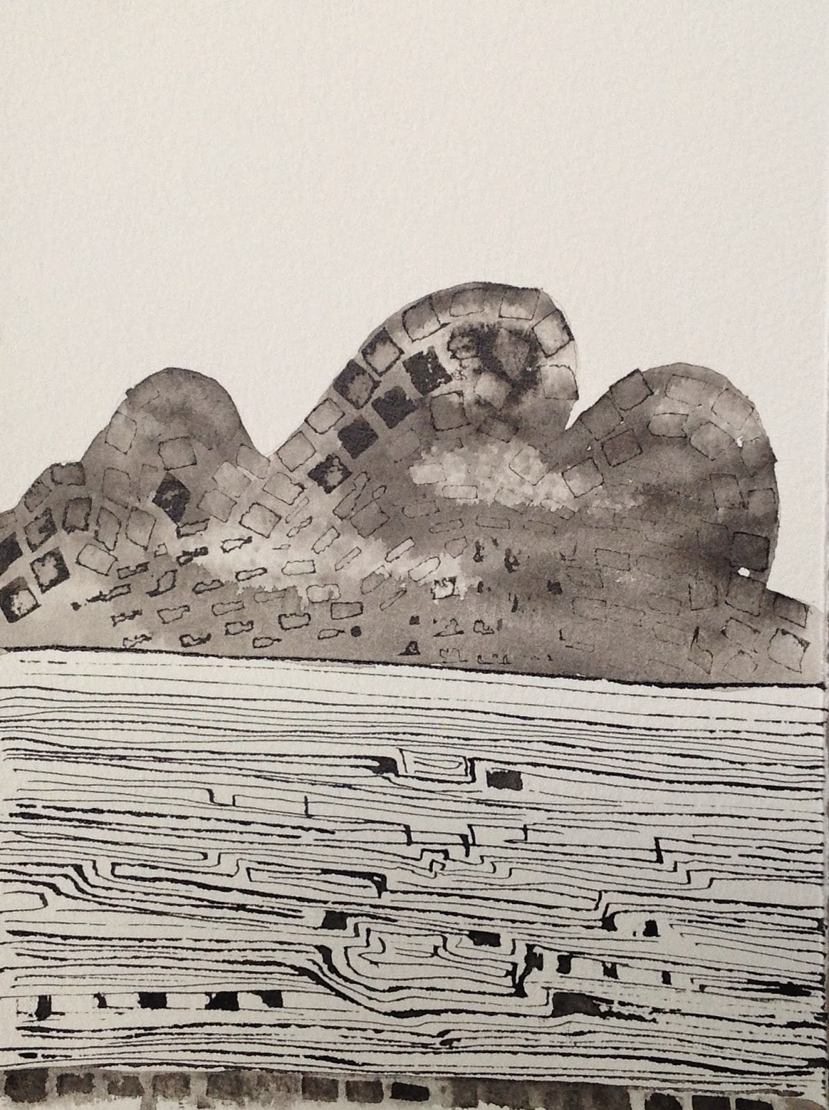
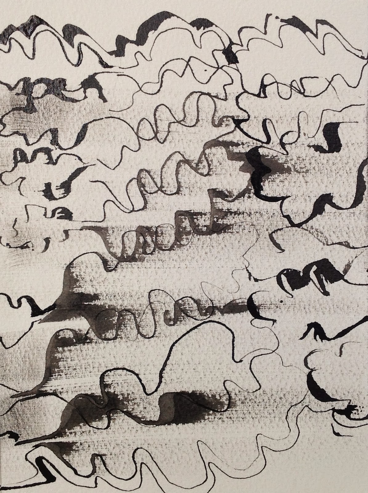
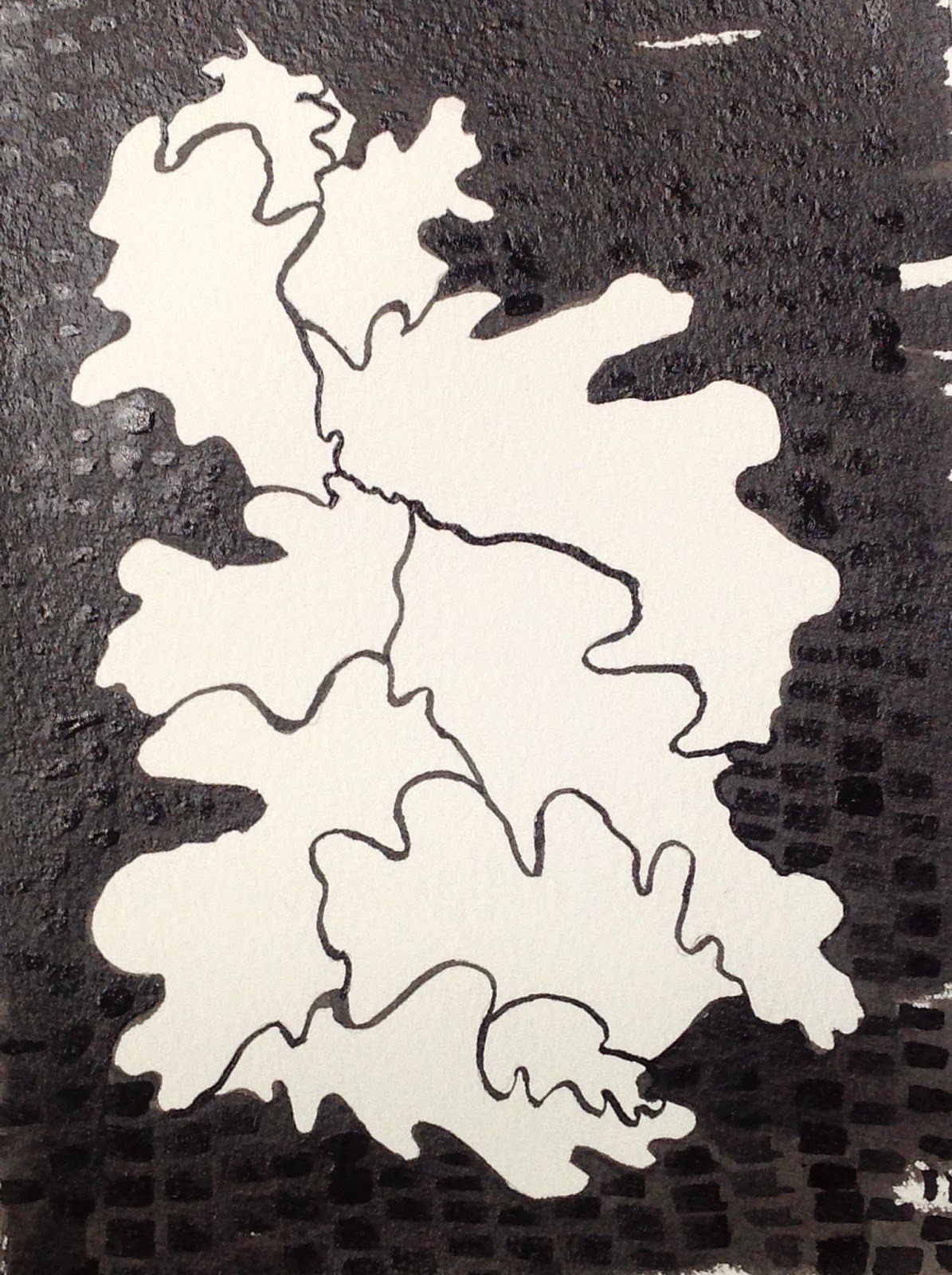
Following on from tutorial with Mandy I decided to produce small ink drawings referencing my sketch book as per 'Hommage a Queneau' by Colin Crumplin, an idea which was originally suggested by Angie Cockayne as a method of 'getting to know my object'.   Using Somerset off white textured watercolour paper and ink my aim is to produce an initial 10 images of each individual component, i.e. tree, acorn, leaf, bark, flower and oak galls.  Once complete I will experiment with presentation, format, placement in order to assess and re evaluate. This will provide an opportunity to look at the images together to assess how they work as one piece. Thought has already been given to cropping, resizing and reproducing images using alternative print approaches, i.e. woodcut, photo etching but realistically I feel that time is a constraint and that focus should be maintained around these ink drawings alongside my more painterly monotypes.  I have in mind to perhaps produce an Artist Book using an innovative presentation but must confess to reservations around this concept.


My attempt at a cubist style image of acorn.  Mark making is quite prescriptive and controlled.  It is an image that resonates with my aesthetic 'eye' with fine line, dark shapes and overlaying of imagery The varying scale and views all contribute to an interesting composition. I plan to crop this image to form a square shape which will perhaps emphasize and introduce the juxtoposition of two geometric shapes and emphasize the form of the acorn.  


A very quick, freely painted image which presents some expressive and beautiful mark making..  I had initially seen it as a failure but on revisiting it proves to have some great qualities, There is a freedom within the mark making, repetition both on vertical and horizontal planes with lines breaking up and different distances apart.  It has a quiet perspective with varying proportions of tree form and a good contrast of tonal values. I would like to reproduce this on a larger scale but find spontaneous results a challenge to reproduce!
I consider this a successful composition and strong piece of imagery. 


Saturday, 7 February 2015

Early 'painterly' monotypes


Whilst researching the history of monoprints and monotypes I came across these very expressive, painterly prints by Frank L. Emanuel (1865-1948). They both capture and present a powerful emotive connection to the landscape, moving away from the figurative to abstraction.
He was a lover of traditional art and very much opposed to modern trends in the art world so these two works stand out from his usual representational landscapes, portraits and interiors. Studying in Paris during the late 19th century he would have been aware of other painters working and experimenting with this approach.

Edgar Degas exhibited his monotypes in the third Impressionist exhibition of 1877 with several artists becoming interested in this form of art thus giving printmaking a status as a result of the creative and spontaneous use of the media. Many artists of this period adopted and adapted this method of working,- Camille Pissarro, Paul Gaugin, Pierre Bonnard, Pablo Picasso, Chagall, Miro, Dubuffet and Matisse amongst them. A common name for them during this period was 'painted drawings'.
It has been suggested that artists experimenting with this type of printing technique were influenced by the early developments of photography with its black and white contrasts and interplay of positive and negative imagery.


'A lowering Afternoon' Monotype 1920 153 x 202mm


'Moonrise over the Sea' Unfinished Mezzotint. 153 x 201 mm.


Wednesday, 4 February 2015

Printing at Sion Hill

It was an effort again to get everything together for a day's printing. Why?  There is no provision to leave equipment and materials on site and it is a case of taking and bringing in everything on each studio visit - it is a chore.  Added to the equation today was a lunch time break - a meeting at Dartmouth Avenue. This not only interrupted valuable, creative time in the studio,but also made the day rather disjointed.  It was frustrating having to break away and then return, I would suggest that these meetings take place early morning or late afternoon so as not to interfere with 'creative flow'..

Choice, choice, choice, Lots of options but decisions on what approach to use always remains a dilemma.  Keep it simple.  Inked up plate and lifted out a simple line to represent the flowers of the Oak tree.  Printed onto rice paper by hand which gave a subtle range of tones. Then took second print onto Japanese paper, passed through etching press. This second print, although not inked up again, gave a greater density of black, yet some areas still remained a little lighter due to my messing about with a brush on the plate .Simple composition with variety of shapes and space.


The print below was inspired by seeing the wonderful new catkins emerging in late January, one of the earliest signs, alongside snowdrops that Spring is on its way, with the day light hours becoming longer. They were situated against the background of the majestic oak tree and created a wonderful representation of the strength and fragility of nature. Some textures were lost as I accidentally used methylated spirits instead of turps to remove and create texture in various areas. 


The image below is a cropped version of the above presenting a different composition. I remain undecided as to which is the most effective!


Towards the end of the day with 10 minutes to spare before clearing up an experimental and very quickly worked monoprint had unexpected, but rather pleasing results.This was created by using several techniques of negative and positive monoprinting processes. Taken from an early sketch worked in brush and ink this is an image which I propose to take further and introduce within 'the field' prints. This has presented a more interesting proposition to developing the work. 


Photographed on the table with all its history of marks added another dimension.